
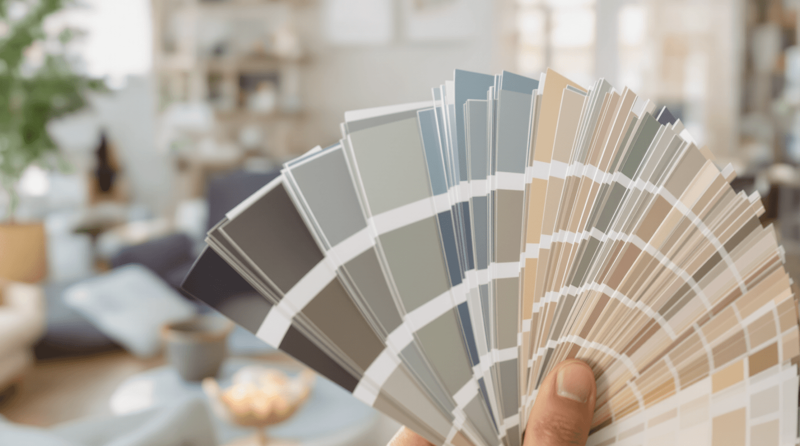
Forget fleeting trends; the real secret to a space that resonates lies deeper, painted across the very walls that surround you. We’re talking about interior design color psychology – the subtle yet powerful art of using color not just to decorate, but to dictate the mood, enhance well-being, and even influence perception. It’s less about the ‘color of the year’ and more about crafting environments that genuinely feel right. Ready to transform your home from mere shelter into a sanctuary tuned precisely to your emotional frequency?
What is Interior Design Color Psychology, Really?
At its core, interior design color psychology is the study and application of how different hues impact human emotion and behavior within a built environment. It’s a fascinating blend of art, science, and intuition. Think of it as the invisible architecture shaping your experience. While personal associations matter, decades of research, including studies cited by institutions like PubMed Central on the effects of color on emotion, have revealed common psychological responses to various colors. Understanding this allows you to intentionally curate atmospheres – energizing a workspace, calming a bedroom, or making a compact living room feel surprisingly expansive.
How Does Color Psychology Work in Interior Design?
It works by tapping into both learned associations and potentially innate physiological responses. Warm colors like reds, oranges, and yellows are often associated with energy, warmth, and stimulation, potentially even slightly increasing heart rate. Conversely, cool colors such as blues, greens, and purples tend to evoke feelings of calm, serenity, and focus. It’s about harnessing these emotional effects of color in rooms to achieve a desired outcome. The intensity, shade, and saturation of a color also play crucial roles; a muted sage green feels vastly different from a vibrant lime. Furthermore, lighting significantly impacts how we perceive color and, consequently, its psychological effect – a topic explored in depth by resources like Architectural Digest’s guide to color psychology.

Can Room Colors Really Affect My Mood? Yes, Here’s How:
Absolutely. While not a magic bullet, the colors you choose have a demonstrable impact. Let’s explore the psychological effects of common colors in home interiors:
- Blue: Often linked to calmness, stability, and productivity. Ideal for home offices (think focus) and bedrooms (think serenity). Lighter blues can feel airy, while deeper blues add sophistication. This aligns with understanding the interior design color psychology effect on mood for concentration.
- Green: The color of nature, symbolizing growth, harmony, and restoration. Excellent for almost any room, promoting balance. It’s one of the best interior design color psychology choices for promoting relaxation.
- Yellow: Associated with happiness, optimism, and energy. Use it strategically in kitchens or dining areas to stimulate appetite and conversation. Be mindful, as too much intense yellow can cause anxiety.
- Red: A powerful color evoking passion, energy, and excitement. Best used as an accent in living rooms or dining rooms to encourage socializing. Use sparingly, as it can be overwhelming.
- Purple: Often associated with luxury, creativity, and wisdom. Deep purples add drama, while lighter lavenders can be calming, similar to blue.
- Orange: Blends the energy of red and the cheerfulness of yellow; signifies enthusiasm and warmth. Good for entryways or exercise rooms.
- Neutrals (Grey, Beige, White): Provide a sense of sophistication, cleanliness, and calm. Excellent backdrops, allowing accent colors to shine. They are key in using interior design color psychology in minimalist apartment design.
- Black: Signifies power, elegance, and sophistication. Best used in moderation as accents to ground a space.
Applying Color Psychology Room-by-Room
Choosing paint isn’t just about aesthetics; it’s about function and feel. Here’s a quick guide:
- Living Rooms: Aim for welcoming and sociable. Warm neutrals, greens, or blues work well. Use stimulating colors like red or orange as accents. Consider how to use interior design color psychology for small living rooms – lighter, cooler tones can make the space feel larger.
- Bedrooms: Prioritize calm and relaxation. Cool colors like blues, greens, and lavenders are prime choices. Explore interior design color psychology principles for creating a calming bedroom.
- Home Offices: What is the best interior design color psychology for home office productivity? Blues enhance focus, greens reduce eye strain, while stimulating accents like yellow can boost creativity.
- Kitchens: Yellows and oranges can stimulate appetite, but avoid common mistakes using interior design color psychology in kitchens, like overly bright schemes that might feel chaotic. Clean whites and greys also work well.
- Bathrooms: Crisp whites and blues evoke cleanliness and calm. Greens can create a spa-like feel. Consider using color psychology for a relaxing bathroom design.
- Children’s Rooms: Consider age and development. Soft blues and greens for calm, yellows for cheerfulness, but avoid overstimulation. Interior design color psychology for children’s room development is a nuanced topic.
Quick Guide: Color Mood Associations
| Color | Common Psychological Associations | Best Room Applications |
|---|---|---|
| Blue | Calm, Stability, Productivity, Trust | Bedrooms, Offices, Bathrooms |
| Green | Harmony, Nature, Relaxation, Balance | Bedrooms, Living Rooms, Bathrooms |
| Yellow | Happiness, Optimism, Energy, Caution | Kitchens, Dining Rooms, Accent Walls |
| Red | Passion, Energy, Excitement, Urgency | Dining Rooms, Living Room Accents |
| Purple | Luxury, Creativity, Wisdom, Spirituality | Bedrooms, Creative Spaces, Accents |
| Orange | Enthusiasm, Warmth, Playfulness | Entryways, Exercise Rooms, Accents |
| Neutrals | Calm, Sophistication, Cleanliness | Any Room (Base or Primary Color) |
Frequently Asked Questions (FAQs) about Interior Color Psychology
What exactly is interior design color psychology?
It’s the study of how colors within interior spaces affect human mood, feelings, and behaviors. It combines principles from psychology and design theory to create intentional atmospheres.
How does color psychology influence mood and behavior within a home?
Colors trigger emotional and sometimes physiological responses. Warm colors tend to energize, while cool colors often soothe. By selecting specific palettes, you can encourage relaxation, focus, socializing, or other desired states.
Which colors promote relaxation or productivity according to interior design color psychology?
Blues and greens are strongly associated with relaxation and calm. Blues, particularly deeper shades, and greens are also linked to enhanced focus and productivity, making them ideal for workspaces.
Are there common mistakes to avoid when using color psychology?
Yes. Overusing intense colors (especially red or bright yellow) can be jarring. Ignoring the impact of natural and artificial light is another pitfall. Also, not considering the specific function of the room or personal preferences can lead to spaces that don’t ‘feel’ right despite following general rules.
Is interior design color psychology based on scientific evidence?
Yes, there’s a growing body of research exploring color’s impact on psychology and physiology. While individual and cultural interpretations exist, general trends and effects are well-documented in psychological and design studies, such as those exploring chromotherapy for spaces and affective interior design.
How important is color psychology in professional interior design?
It’s fundamental. Professional designers use color theory and psychology as key tools to create spaces that are not only aesthetically pleasing but also functional and emotionally resonant for the occupants. It’s crucial for branding spaces too, conveying specific messages and values.
Ultimately, understanding interior design color psychology empowers you to be the master of your home’s mood. It’s about moving beyond random choices and intentionally crafting environments that support your lifestyle and well-being. So, the next time you pick up a paintbrush, think beyond the shade – consider the feeling. What story will your colors tell?